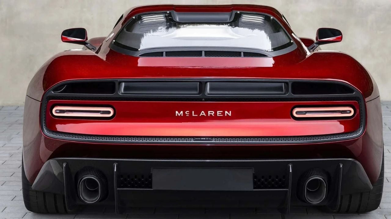
McLaren recently revealed a new logo, evolving its current design into one with smaller lettering and a smaller ‘c’ to change the name’s aesthetic. And it’s generated a lot of online debate as enthusiasts argue over how good it is.
The new logo was revealed just a few days after McLaren said it would expand production with a brand-new second factory in the UK. It is more minimalist than the old logo, although the trademark Speedmark logo remains, so don’t worry about losing that.
Some, however, are not happy with the new logo style. Many have said it looks and feels incredibly boring, and some on Reddit have even said it makes McLaren look like a coffee shop brand rather than an iconic automotive manufacturer.
However, there is far more to this than just a new logo and smartening up the design. The new wording font is a direct link to when the company’s founder, Bruce McLaren, ran a service station in his native New Zealand. McLaren has taken inspiration from the original signage to come up with its new wordmark design.
Why McLaren Created Its New Logo
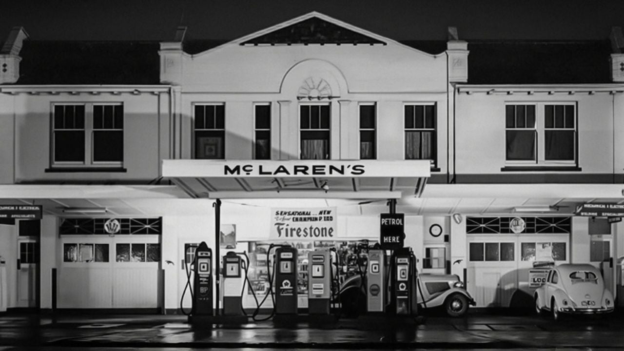
McLaren’s new logo will be used on its next-generation cars, including its upcoming SUV. The first car to wear the new branding will be the McL 6GT, which was revealed last month at Monterey Car Week in California. All future models will have the brand’s name spelled out in this style across the rear of them. The logo itself is actually adapted from one that Bruce McLaren used.
McLaren ran the family workshop in Auckland, New Zealand, which was owned by his parents, where he developed his interest in cars and engineering. The company says that it was in this workshop that McLaren built the car that would take him to his first win, a modified Austin Seven that won at Muriwai Beach. Chief creative officer David Woodhouse said, “This has been about finding ourselves – coming back to what is essentially us, our founder, the basis of our brand and our mark.”
There is one important thing to caveat. With its roots in the past, it would be easy to say this is a new, retro-inspired logo. However, that is far from the case. McLaren is very keen to point out that this is not a retro design or retro-inspired. In fact, they argue that this is more about the future of the company as a whole, without forgetting the past and where McLaren came from.
McLaren Believes the Logo Is Right for the Future
“I would caution everyone that this is not a retrospective action – this is not just a retro interpretation of who we are,” said Woodhouse. “We would not describe the name or the car as retro – I think you need to be very clear about that,” he added. In fact, not only is it about the future, but it is also about acknowledging the man who founded the company.
For those reasons, McLaren opted to change its logo and adopt this design. “There’s been a period of not recognising our founder, not showing him, and we wanted to come back to this great foundation of what we’re about,” said Woodhouse. The logo has certainly caused debate online, but there is no denying it is a nice way to pay homage to the man who started it all.