If you’ve driven through any mall parking lot in the last ten years, you’ve probably experienced the visual sensation of staring directly into a concrete wall. Gray cars. Silver cars. White cars. Black cars. Repeat until the will to live fades gently away. It’s been a long, monochromatic stretch, but according to a new report from Car and Driver, the automotive color palette might actually be waking up from its grayscale coma.
Pantone Color Institute automotive expert Gloria Jover says the data points to something she calls an “evolving rather than stagnating” color landscape, with a two-percentage-point uptick in non-neutral finishes in recent years. Two percent doesn’t sound like a revolution, but after the last few decades of collective beige surrender, we’ll take it.
So why did we end up here in the first place? A few reasons, and they’re all deeply, painfully logical.
The Real Reason Your Neighbor’s Car Looks Like a Rain Cloud
Nearly 80% of American new-car buyers reportedly choose neutral shades like gray, white, or black, and resale value is a big part of that thinking. The logic goes: a bold color is a gamble, and most buyers would rather not find out whether the next owner shares their enthusiasm for burnt orange. It’s the automotive equivalent of painting your rental apartment eggshell white and calling it “timeless.”
There’s also a supply issue quietly baked into the system. Dealers stock what moves fastest, and what moves fastest is… gray. Brighter colors often mean longer wait times and, frequently, extra money out of pocket. Take the Ford F-150 as a prime example: colors like Oxford White and Carbonized Gray Metallic come at no additional charge, while stepping into something like Ruby Red Metallic or Antimatter Blue Metallic can add hundreds of dollars to the sticker price. For a truck buyer already stretching a budget, that’s an easy sacrifice.
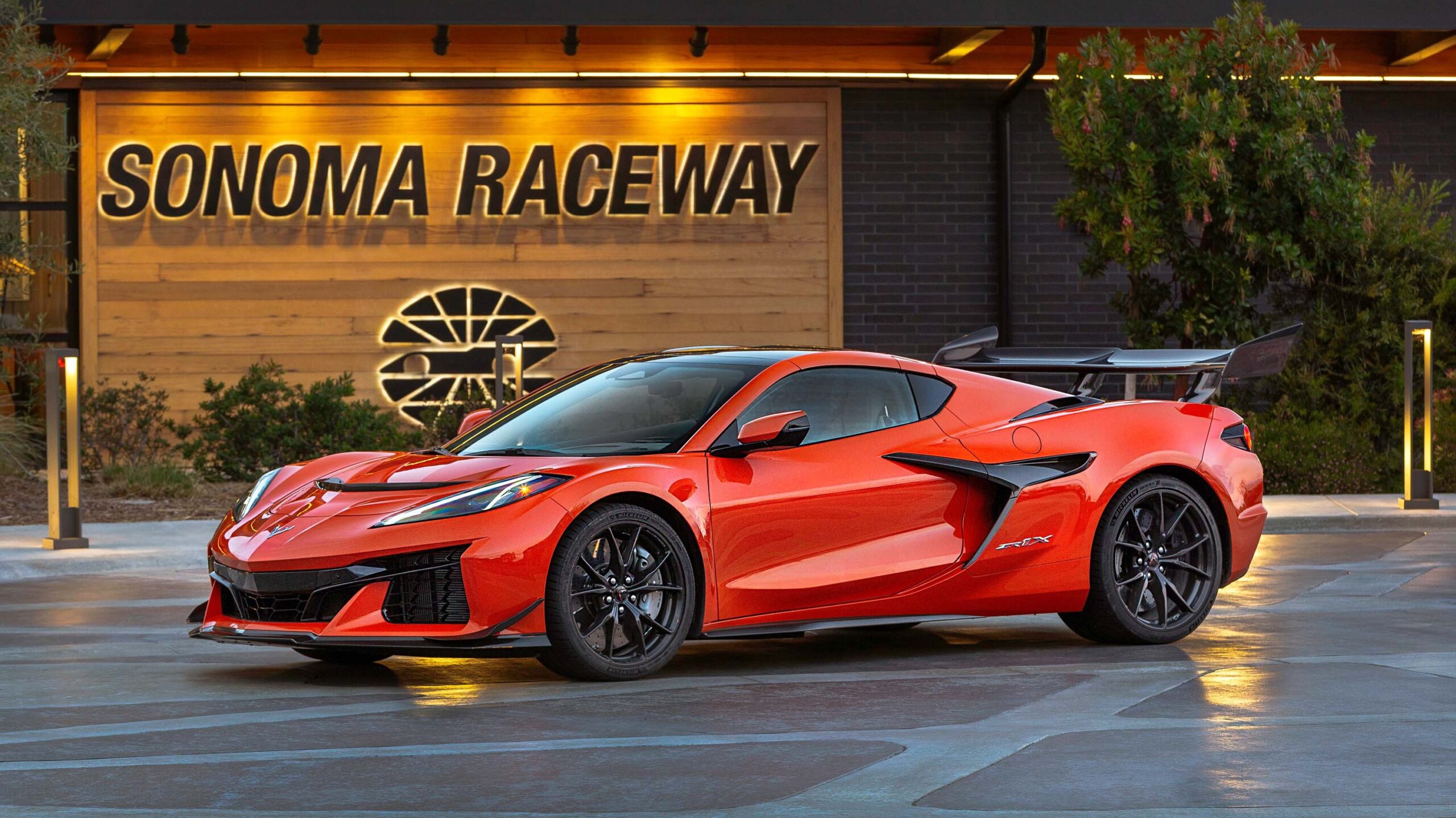
That said, color isn’t always a liability. A 2014 Porsche Cayenne in Jet Green Metallic sold for a jaw-dropping $125,000 last year, partly because the finish made it genuinely unforgettable. Of course, it also had a manual gearbox, so it was already the unicorn of the decade before anyone even looked at the paint.
The takeaway: bold colors work better on vehicles with a story to tell. A neon yellow Toyota Camry is a different conversation entirely.
Green, Violet, and Orange Are Apparently Having a Moment
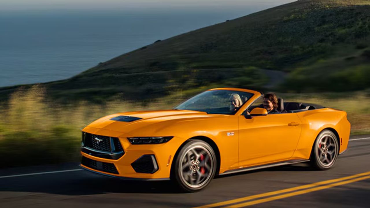
The colors gaining ground right now make a certain kind of cultural sense. Green, with its obvious ties to the outdoors, is leading the charge. Violet is reportedly linked to a growing interest in space exploration aesthetics, which sounds slightly absurd until you remember that half the population spent the last few years watching rocket launches on their phones. Orange, meanwhile, is being tied to golden-hour photography and rugged outdoor imagery, which tracks given how much of modern car marketing looks like a hiking Instagram account.
Pearl white finishes are also climbing, particularly in the electric vehicle space, where the clean, minimalist look suits models like the Tesla Model 3 perfectly. It’s a slightly more interesting take on white, which feels like the automotive equivalent of upgrading from tap water to sparkling.
Will any of this meaningfully change what you see on the highway? Probably not overnight. But if personal expression continues to bleed into every corner of daily life, from social media feeds to sneaker choices, it seems reasonable that buyers might eventually start asking a little more of their vehicle’s exterior too. The parking lot of the future might actually have some personality.
Fingers crossed.