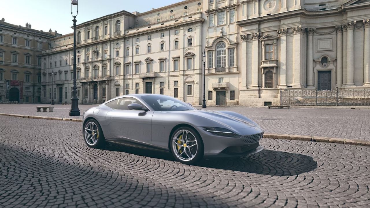
Some cars announce themselves before they ever move. Ferrari is one of them. Long before horsepower figures or lap times enter the conversation, a Ferrari communicates something more profound, a sense of intent, emotion, and identity that goes beyond performance metrics.
Racing heritage is part of that story, but it’s not the whole explanation. What truly makes Ferrari feel different is a collection of choices shaped by Italian automotive culture — where design is expressive, history is carried forward, and interaction matters as much as output. These decisions aren’t always practical or cost-efficient, and they aren’t meant to be. They exist because Ferrari was formed in a place where passion, tradition, and a touch of theater are inseparable from engineering excellence.
That philosophy is why a Ferrari doesn’t just perform; it excels. It resonates.
The Prancing Horse Badge
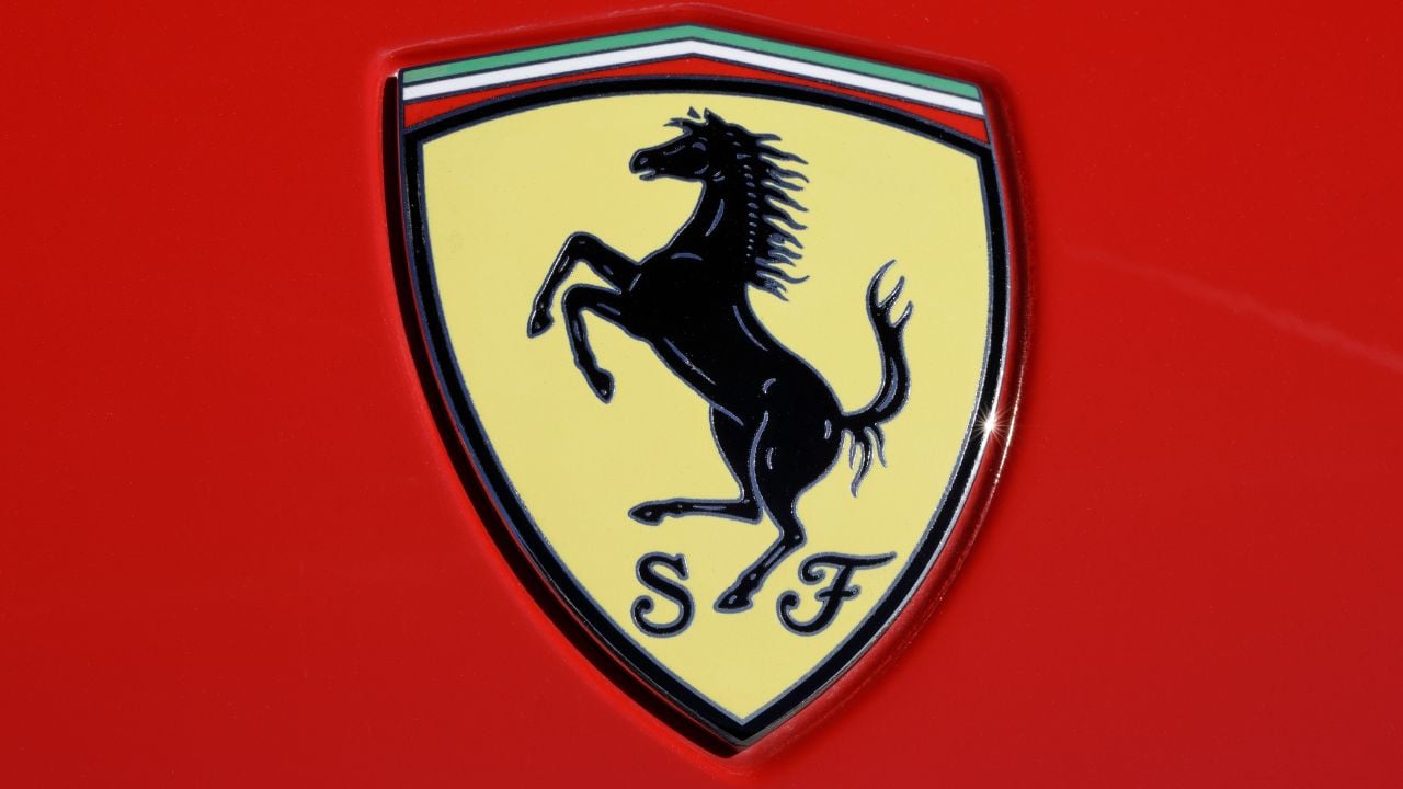
Ferrari’s most recognizable feature isn’t a body line, an engine layout, or even a color. It’s the prancing horse, a symbol so intertwined with Italian racing history that understanding it explains more about Ferrari’s identity than any design choice on the car itself.
The emblem traces back to Italian World War I fighter ace Francesco Baracca, who painted a prancing horse on his airplane as a nod to his cavalry roots. When Enzo Ferrari met Baracca’s parents in 1923, they encouraged him to adopt the symbol for good luck on his race cars. Enzo accepted, but added one important touch: the yellow background, “Giallo Modena,” the official color of his hometown.
From that moment on, the logo wasn’t simply a decoration; it became the story of Ferrari itself. It represented bravery, Italian pride, elite performance, and the relentless drive to win. For a company that started as a racing team long before it built road cars, the emblem became a badge of identity rather than branding.
Ferrari has refined the horse’s proportions over the years, sharpening its musculature, posture, and sense of motion, but the meaning has never changed. It remains a symbol of racing passion, Italian craftsmanship, and the pursuit of excellence — a reminder that every Ferrari, no matter how luxurious or high-tech, is still the product of a motorsport-first philosophy.
This isn’t just a logo. It’s Ferrari’s racing DNA, distilled into a single image.
Seeing Red

Ferrari now offers more than thirty factory paint colors, and Tailor Made clients can even create their own, yet red still defines the brand’s image. About 40% of new Ferraris are still ordered in red today. That is a significant drop from the early 1990s, when more than 85% of buyers chose red, but it shows how strong the connection remains even as customers branch into silver, black, yellow, and blue.
Ferrari has recognized this shift itself; recent headline cars like the 458 Speciale Aperta, F12tdf, LaFerrari Aperta, and 488 Pista Spider all debuted in colors other than red.
The roots of Rosso Corsa go back to the early 1900s, long before Ferrari existed. International racing rules assigned each country a national color:
- France in blue
- Britain in Green
- Germany in white (later the bare metal “Silver Arrows”)
- Italy in red
Italy’s national racing color became red in the early 1900s as part of the era of national racing colors, though the exact reason the switch settled on red is reported differently across historical accounts — including the ones a young Enzo Ferrari watched with awe — wore Rosso Corsa.
There is also a deeper national tie: red had been a symbol of Italian unity since the 1800s, popularized by revolutionary general Giuseppe Garibaldi and his red-shirted volunteers. By the time Ferrari entered motorsport, the color already carried emotional weight.
It is a century of Italian racing culture condensed into a single color — the one shade that still feels “correct” on a Ferrari, even in a rainbow of modern choices.
Open-Gate Manual Transmissions
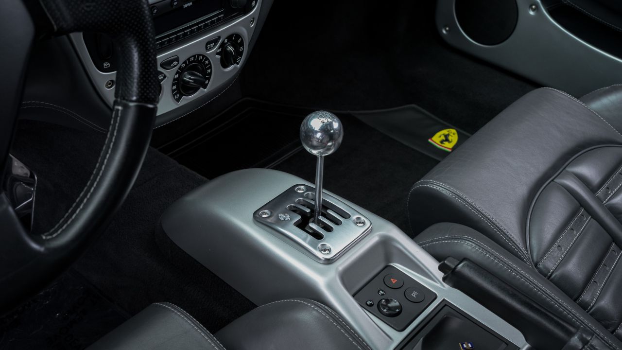
Before Ferrari shifted almost entirely to dual-clutch automatics, the brand offered something that made driving purists genuinely emotional: the open-gate manual transmission.
Instead of hiding the shift mechanism under a leather boot, Ferrari proudly displayed it. A metal gate surrounded the shifter, making each gear change feel like operating a piece of machinery that belonged in a racecar.
This wasn’t about function. It was about the theater of driving. Italian design philosophy often prioritizes emotional engagement over pure efficiency, and the open-gate shifter embodied that perfectly.
The Manettino Dial
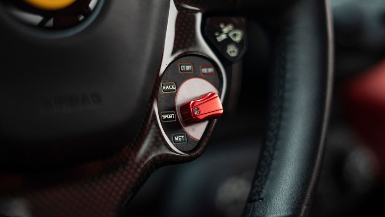
Ferrari could have managed its drive modes through screens or discreet buttons, but that approach would have stripped the experience of intent. Instead, the brand uses the Manettino — a small rotary dial mounted directly on the steering wheel — placing control where the hands naturally rest.
The choice reflects Italian design priorities, where interaction matters as much as function. Turning the Manettino is deliberate and tactile, closer to adjusting a mechanical instrument than navigating software. The name itself translates to “little lever,” reinforcing the idea that the driver should feel the change, not merely select it.
This approach mirrors broader Italian design traditions, from industrial objects to automotive interiors, where physical engagement is valued over abstraction. The Manettino isn’t about maximizing efficiency. It’s about reinforcing the connection between driver, machine, and intent.
V12 Engines
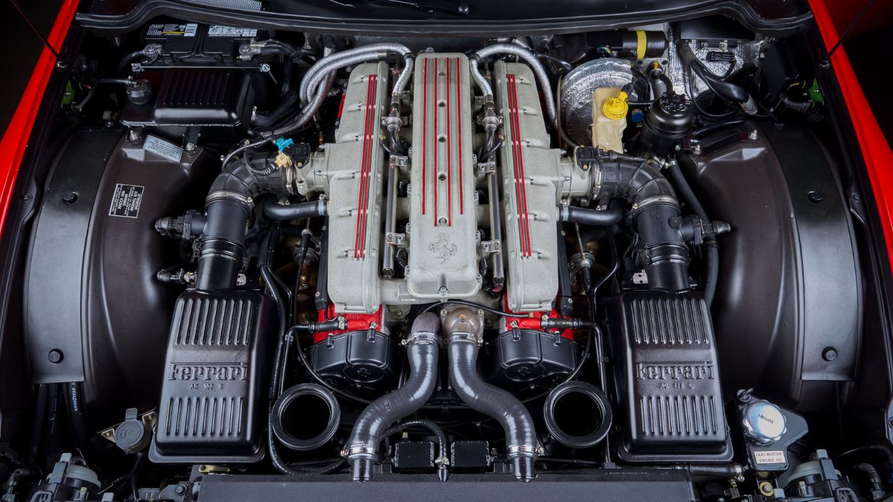
Ferrari has proven repeatedly that V8 and hybrid powertrains can deliver extraordinary performance. And yet the company continues to build V12 flagships — not because they are necessary, but because they are meaningful.
In Italian automotive culture, the V12 represents balance, continuity, and emotional richness. It carries the legacy of grand touring machines designed to cover distance with speed, sound, and presence. The appeal isn’t rooted in optimization or cost. It’s rooted in experience.
The V12 endures because it expresses Ferrari’s identity more completely than any specification sheet can. Like many Italian traditions, it survives not because it is the most efficient solution, but because it remains the right one — technically impressive, emotionally resonant, and deeply tied to heritage.
Interior Color as Italian Design Language

Color plays a central role in Ferrari’s interiors, but not as decoration or trend. It is treated as a design language shaped by Italian craft, landscape, and material tradition — the same influences found in architecture, fashion, and furniture design across Italy.
Modern Ferraris can be configured with an extensive range of leather and Alcantara® colors, many of them inspired by Italian places, materials, and light rather than motorsport. Warm reds recall historic city walls and Tuscan villas. Earth tones echo stone, soil, and aged leather. Greens draw from gardens, forests, and formal landscapes surrounding Italian estates, while blues reference the Mediterranean coast.
Rather than pushing contrast for shock value, Ferrari encourages composition. A single color can be carried throughout the cabin and expressed through different textures — smooth leather, perforated panels, Alcantara® inserts, carbon fiber, or stitching — creating depth without visual noise. Alternatively, colors can be layered carefully, with material choice doing as much work as hue.
This approach reflects a distinctly Italian design philosophy: harmony over minimalism, expression over neutrality, and craftsmanship over uniformity. The cabin isn’t meant to disappear around the driver. It’s intended to feel considered, tactile, and personal.
In a Ferrari, interior color isn’t an afterthought or a branding exercise. It’s part of the car’s identity — a continuation of Italian design values translated into leather, fabric, and form.
The Start Button: Ritual, Reconsidered
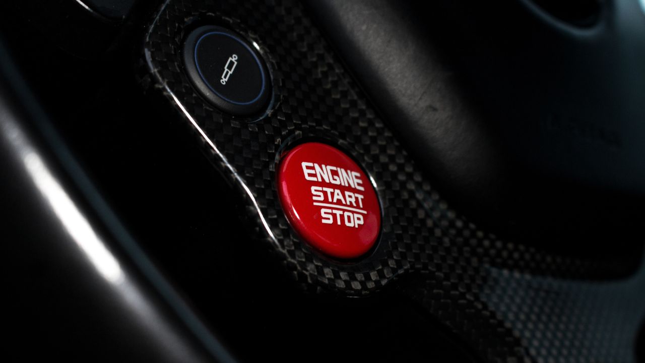
Ferrari’s start button tells a clear story about how the brand thinks about interaction.
Early Ferraris used traditional ignition keys, but that changed in the mid-2000s with the F430, which introduced a bright red engine start button on the steering wheel alongside the manettino. The placement made starting the car a deliberate act, reflecting an Italian design instinct that necessary actions should feel intentional and visible.
In the 2010s, Ferrari shifted toward touch-sensitive and haptic steering wheel controls. While modern in theory, the approach removed tactile feedback and made simple actions less intuitive, drawing criticism from drivers.
Ferrari listened. Newly unveiled models—such as the Amalfi, a 2027 model-year car—**mark a return to physical controls and a proper aluminum start button—a real, machined-metal switch with physical travel, not a touch-sensitive surface. Ferrari leadership has said the move away from physical buttons was a mistake, and that physical controls will return across future models.
The message is clear: for Ferrari, progress only works when it preserves feel. Technology is welcome, but physical connection and intent still come first.
Mid-Engine Layout as Intentional Design
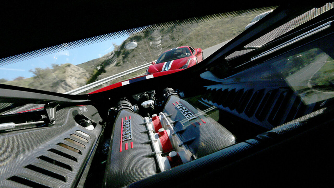
Ferrari embraced mid-engine layouts for road cars early because the configuration aligned with how the brand believes a performance car should feel.
Placing the engine behind the driver prioritizes balance, responsiveness, and harmony over convenience. It reshapes proportions, limits storage, and complicates packaging — tradeoffs Ferrari has long accepted. Italian design tradition often favors experience over accommodation, and the mid-engine layout reflects that mindset.
The result isn’t practicality. It’s a driving position and dynamic balance that feels purposeful, even when the car is barely moving.
Scuderia Identity as Living Heritage

Ferrari doesn’t treat racing history as a reference point. It treats it as something ongoing.
The Scuderia shields, race-derived names, and visual continuity aren’t decorative callbacks. They reflect a company that never separated its competitive identity from its road cars. In Italian culture, history isn’t preserved by freezing it in time — it’s carried forward, refined, and reused.
For Ferrari owners, that lineage isn’t symbolic. It’s built into the car itself.
Sound as a Designed Experience

Ferrari approaches engine sound as a design element, not a side effect.
The way a Ferrari builds volume, tone, and texture through the rev range is deliberately shaped to create emotion and progression. Rather than chasing noise for its own sake, the brand focuses on clarity, character, and response.
Italian culture has long treated sound as expressive, from opera to mechanical craft, and Ferrari applies that same sensibility to its engines. The result isn’t just volume. It’s communication.
When Design Philosophy Becomes the Experience

Driving a Ferrari is defined less by specifications than by a collection of choices shaped by Italian design values: ritual over convenience, expression over neutrality, and heritage treated as something alive rather than preserved.
These decisions aren’t meant to dominate comparison charts. They exist because Ferrari was shaped by a culture that values feeling, intent, and identity as much as precision.
That’s why Ferrari feels different. Not louder. Not faster. Different, in a way that doesn’t require explanation, even when the grocery run involves carbon fiber and very little cargo space.