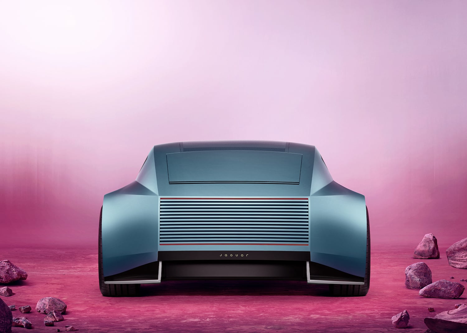
Unfortunately, we all saw it. The internet had a field day when Jaguar dropped its new visual identity earlier this year — minimalist wordmark, flattened logo, and a vibe that screamed “tech startup does makeup line” more than “British luxury icon.”
People weren’t just confused. They were mad. The memes were instant. The backlash was brutal, with a major player on the Jaguar design team even reportedly getting fired.
But here’s the thing: Jaguar knew exactly what it was doing. Sort of.
When Your Last Plan Tanks, You Admit It

Managing director Rawdon Glover didn’t sugarcoat it in recent interviews. The previous strategy? It bombed. Sales tumbled into the low five figures globally — a devastating number for any premium automaker, let alone one with Jaguar’s racing pedigree. Glover essentially said what most companies won’t: they tried something, it flopped, and now they’re tearing up the whole playbook.
“It didn’t work commercially,” Glover admitted plainly. No corporate spin. No “we’re evolving our brand language.” Just straight talk about a brand that was hemorrhaging customers and relevance.
“The reaction has been fascinating,” he told Top Gear. “It correlates strongly with the clinics. You get a group of people who get it straight away, love it, and want to see it. You get another group who say, ‘I don’t understand it. I don’t know where Jaguar has gone.’ But when you unpack the story and explain the thinking, they say, ‘Okay, I get it now.'”
The Type 00 Problem: Too Bland, Too Fast

So why did the Type 00 identity — that stark, ultra-minimal look — become such a lightning rod? Critics argued it stripped away everything that made Jaguar Jaguar. The leaping cat? Barely recognizable. The connection to decades of gorgeous, curvaceous cars like the E-Type? Gone. What remained felt cold, generic, and weirdly out of sync with a moment when consumers actually crave brands with personality.
Sue Benson, CEO of The Behaviours Agency, nailed it when she suggested the rebrand misread the room entirely. Just as people were getting tired of flat, characterless logos, Jaguar went full minimalism. There was no emotion, no identity, no legacy… The identity was stripped away entirely.
“In a market where EV brands are multiplying, distinctiveness matters more than ever,” she explained. “Jaguar already had strong emotional and cultural heritage, so it’s worth questioning whether stripping that away in favour of minimalism was the right move.”
The Real Crisis: Nobody Young Cared

Design drama aside, Jaguar faced a more existential problem: its customers were literally aging out. Younger luxury buyers — the Gen Z and millennial crowd with disposable income — were flocking to Tesla, Porsche, and even Genesis. Jaguar? Not even on their radar.
The Type 00 rebrand was supposed to fix that by looking sleek and digital-friendly. Instead, it alienated the brand’s few remaining loyalists while giving newcomers zero reason to pay attention. You can’t just slap on a modern font and call it a day when your entire value proposition is murky.
The Big Pivot: Smaller, Pricier, Bolder
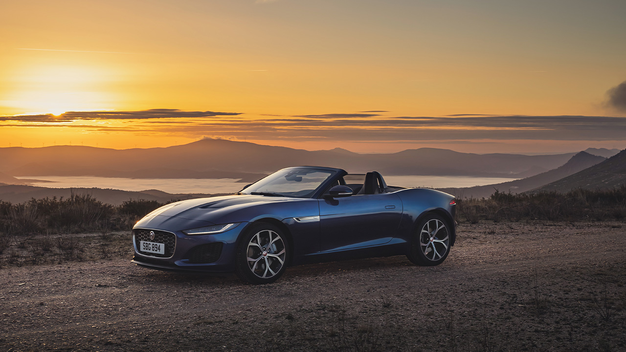
Now Jaguar’s doubling down on something completely different. They’ve paused production (yes, seriously — no new Jags rolling off the line) to relaunch as an ultra-luxury electric brand. Think fewer models, higher prices, and a design language they’re calling “exuberant modernism.”
Translation: they’re done chasing volume. Instead, they want to be the fashion-forward EV choice for wealthy buyers who want something that looks nothing like every other electric sedan on the road. Their new “Copy Nothing” campaign is basically an attempt to cut ties with minimalist conformity — ironic, given where they just came from.
Honestly? Nobody knows. Jaguar’s betting everything on a handful of ultra-premium EVs and a brand identity that they hope feels expressive rather than sterile. They’ve revamped the logo again, brought back more sculptural elements, and positioned themselves somewhere between automotive and lifestyle luxury.
But here’s what makes this moment different: they’re not pretending the last attempt was fine. They’re owning the failure, which is refreshingly rare in the car world. Whether that honesty translates into sales depends entirely on whether their upcoming electric models can match the drama of their rebrand.
For a brand that once defined British cool, it’s a heck of a gamble. But after watching the old strategy crash and burn, Jaguar figured the only way out was to blow it all up and start over.
At least this time, they’re being honest about why.