
You see them every day on your commute, parked at the grocery store, and racing past on the highway. Car logos are so familiar that we barely give them a second glance, but these tiny emblems are packed with fascinating stories, clever symbolism, and hidden meanings that most drivers never notice.
Let’s take a closer look at some automotive badges that have more going on than meets the eye.
BMW: More Than Just Propellers

Most people think BMW’s circular logo represents a spinning airplane propeller, referencing the company’s aircraft engine manufacturing roots.
While BMW did make airplane engines, the logo actually shows the colors of the Bavarian flag: blue and white in alternating quarters. The propeller connection is a happy coincidence that the company has embraced over the years, but the real meaning celebrates BMW’s German heritage from the Free State of Bavaria.
Mercedes-Benz: A Three-Way Promise

That iconic three-pointed star isn’t just a sleek design choice: it represents Mercedes-Benz’s original ambition to create engines for land, sea, and air transportation. Each point symbolizes one of these domains, reflecting the company’s early vision of universal motorization.
It’s a bold statement of engineering confidence that proved remarkably prescient, considering how Mercedes engines have indeed powered everything from cars to boats to aircraft, according to Mercedes.
Audi: Olympic Inspiration

The four interlocking rings of Audi tell the story of a corporate merger that created automotive history. Each ring represents one of the four companies that joined together in 1932: Audi, Horch, DKW, and Wanderer, forming Auto Union AG.
The overlapping design suggests unity and cooperation, often compared to the Olympic rings, but actually represent the Auto Union merger.
Subaru: A Stellar Family

Look closely at Subaru’s badge and you’ll see a cluster of six stars, which isn’t random celestial decoration. The logo depicts the Pleiades star constellation, known as “Subaru” in Japanese, but there’s a deeper meaning at play.
The large star represents Fuji Heavy Industries (Subaru’s parent company), while the five smaller stars symbolize the five companies that merged to form the automotive division, creating one unified family under the Subaru name.
Toyota: Hidden Letters in Plain Sight
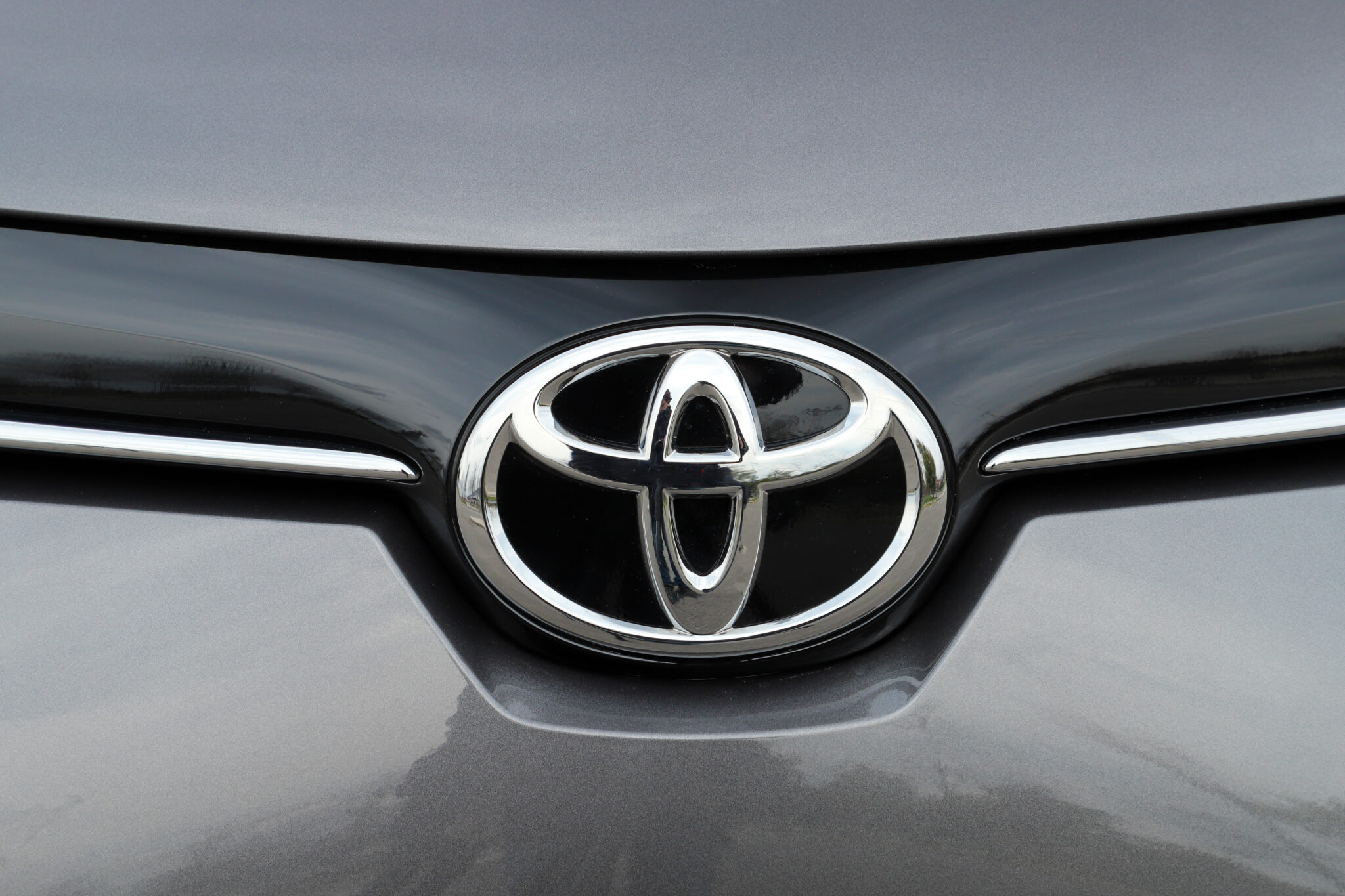
Toyota’s overlapping ovals create more than just an attractive geometric pattern – they cleverly spell out the company name. The inner ovals can be read as a stylized “T” for Toyota, while the outer oval completes the letter.
Additionally, the three ovals represent the hearts of customers, the heart of the product, and the heart of progress in technology, embodying Toyota’s customer-focused philosophy.
Hyundai: A Handshake Deal
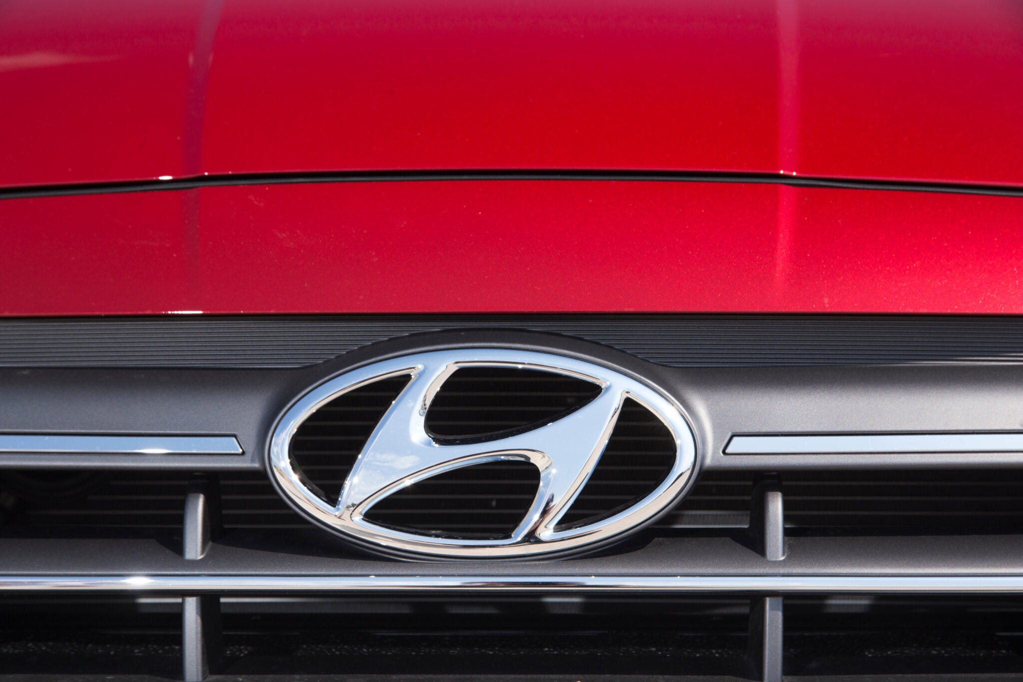
While it might look like a simple italic “H,” Hyundai’s logo actually represents two people shaking hands. The slanted oval shows a customer and company representative reaching an agreement, symbolizing trust and satisfaction.
This human-centered approach to branding reflects Hyundai’s emphasis on customer relationships and their commitment to reliable service and products.
Volvo: Ancient Strength
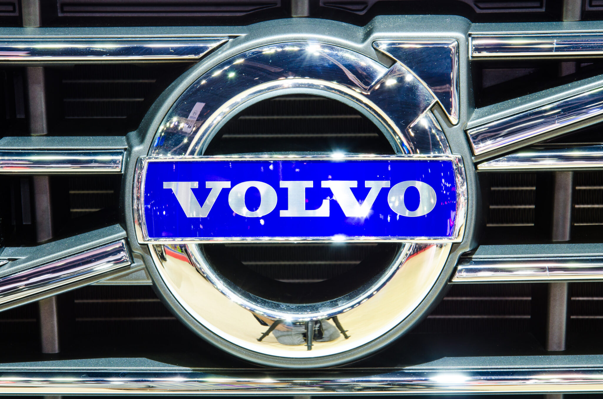
Volvo’s arrow pointing diagonally upward comes from an ancient symbol for iron: the same symbol used in chemistry and alchemy. The Swedish automaker chose this emblem to represent the strength and durability of Swedish steel, which was renowned throughout Europe.
The diagonal line also doubles as the symbol for Mars, the Roman god of war, further emphasizing themes of strength and resilience that define the Volvo brand.
Peugeot: A Lion’s Evolution
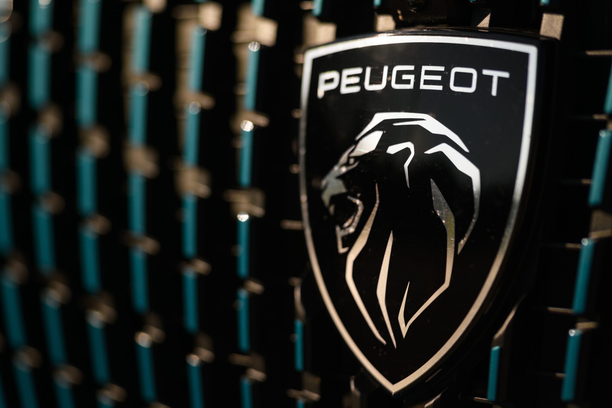
Peugeot’s lion has been prowling on their vehicles since 1847, making it one of the world’s oldest automotive logos. Originally designed for the company’s steel tools business, the lion symbolized the strength, flexibility, and sharpness of their saw blades.
When Peugeot moved into automobiles, they kept the lion but evolved its pose over the decades: from standing to walking to the current streamlined profile that suggests speed and forward motion.
The Art of Automotive Storytelling

These hidden meanings remind us that car logos are more than just brand identification: they’re compressed corporate autobiographies, telling stories of heritage, values, and aspirations in symbols small enough to fit on a hood ornament.
The next time you’re stuck in traffic, take a moment to decode the messages surrounding you. You might discover that every parking lot is actually a gallery of miniature masterpieces, each one sharing a unique story about the company behind the wheel.